


Art Direction + Design
Google Brand Studio 2015
_
Utensils that adapt to tremors, contacts that monitor glucose, wearables that warn users of impending heart events. Verily uses science to make lives better in a real, tangible way. They thrive in the intersection of life and data, and their brand had to feel firmly planted in each of those worlds.
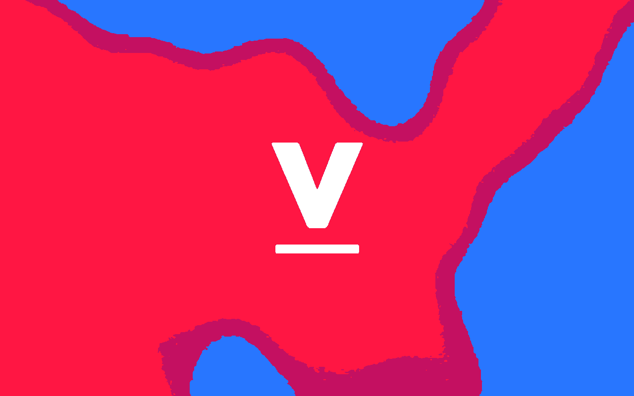
The form is inspired by the scientific process. The bar is a constant, a launchpad for discovery and possibility. The V is the variable, and represents the wide range of work done at Verily. It can be activated through the visual language of biology and data to take on new life and meaning across different applications and mediums.
The blue-to-red gradient, applied across all brand materials, is inspired by the visible light spectrum, medical imagery, and the vibrant lights and dyes used in Verily's studies. These colors are intimately understood by scientists and deeply rooted in the culture of research and data visualization. We chose intentionally punchy, "digital" colors to make sure the brand felt fresh and modern.
In a few quick weeks, our small team developed a dynamic identity that gave life to Verily's mission and set them apart from their competitors in an exciting way. At launch, the company became a trending topic on Facebook, and was reported on positively by many major news outlets. Most importantly, the identity was met with overwhelming enthusiasm from the Verily team, who proudly sport the logo on shirts, jackets, and stickers — around their office and into the world.